EDITORS NOTE: To commemorate Major League Soccer's 25th season, the full collection of new 2020 MLS kits will be presented at a star-studded jersey celebration event on Wednesday, February 5, in New York City. Houston Texans wide receiver DeAndre Hopkins, actor Colin Hanks, pro gamer Ninja and LA Galaxy star Javier "Chicharito" Hernandez will all be on hand at the FORWARD25 Jersey Celebration, which will be held as part of Fashion Week.
The arc of kit design in MLS this decade ran from the retrospectively unappealing all-around design of 2010 through 2012 or so, to the often overly-simple templates of the end of the decade.
It’s not really unsurprising that many of the kits on this list fall in the middle of that transition or stand out entirely among those years. It’s also not surprising that many of the choices are multicolored secondary kits. Variety makes everything a little less dull. The monochromatic kits that did make the list demanded an element that made them stand out among the fray.
It’s also not surprising that none of these kits are all red. Why is, like, half the league all-red?
And yes, we did leave your favorite off on purpose.
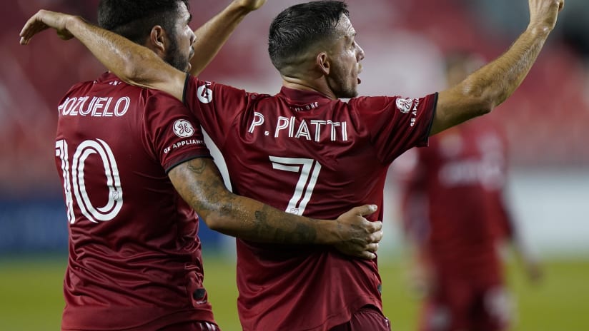
Toronto FC secondary kit, 2016-17
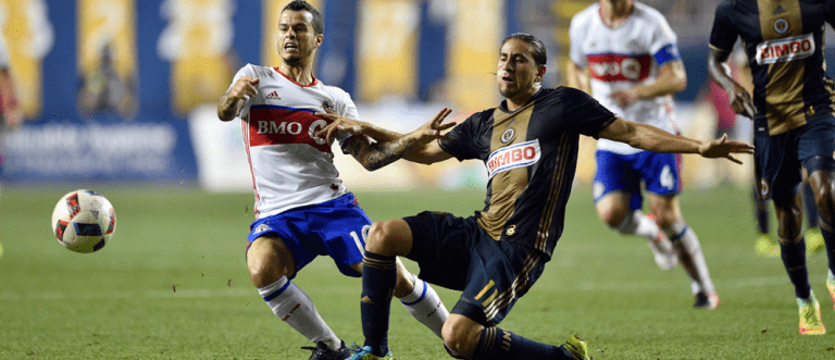
Sebastian Giovinco (left) in TFC's 2016-17 secondary kit | USA Today Sports Images
Toronto fans bristled a bit at the idea of including any shade of blue in their kit, but it’s hard to argue with the results. The white, red and blue became one of the sharpest and most distinguishable secondary kits in MLS, and they’ll forever be associated with a side that came inches from an MLS Cup in 2016, then turned into a treble-winning juggernaut the following year.
Sporting KC third kit, 2013
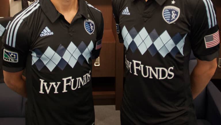
Sporting's famous black argyle kit | Sporting Kansas City
I’m not a fan but I was also told that I would be quickly tried and executed by the MLS community if I didn’t include them. Argyle is… it’s definitely a pattern. Look, y’all want the kit embodiment of a terrible Vampire Weekend song. Who am I to judge, except a person with a platform on MLSsoccer dot com that you don’t have because you’re wrong?
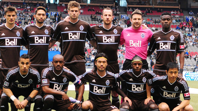
Vancouver Whitecaps third kit, 2012
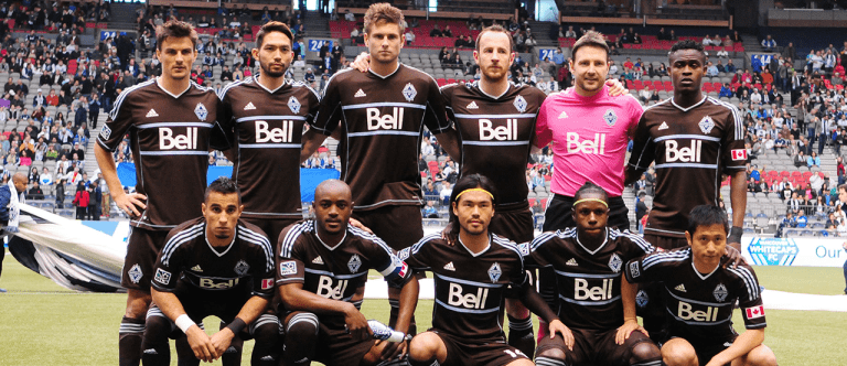
The 2013 Whitecaps in their "arbutus brown" kit | USA Today Sports Images
This might be polarizing, but that’s exactly why it’s on the list. It’s very easy to recoil at the sight of the brown and light blue, but it’s just as easy to instantly love it. If you’re in the latter camp then you probably have no issues with throwing hands or mean internet words to defend it.
This is one of the most distinct kits of the decade and it’s a color scheme that stands out even further in a growing sea of white, black and gray.
Colorado Rapids secondary kit, 2017
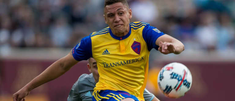
Kortne Ford sports the Rapids' 2017 alternate look | USA Today Sports Images
The biggest question when deciding if Colorado’s state flag-inspired second kit would make the list was which version to pick rather than if it would make the list. I’m partial to the blue-sleeved edition, but I won’t argue against any of its predecessors.
It always felt like one of the league’s most instantly recognizable kits and it’s a shame it’s not with us anymore. For now, anyway.
Columbus Crew SC primary kit, 2017
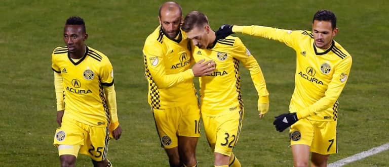
Crew SC celebrate a goal during the Audi 2017 MLS Cup Playoffs | USA Today Sports Images
Columbus have always stood out in all-yellow. You can count the number of teams who wear all-yellow on one hand, if you can think of any others at all besides Borussia Dortmund on occasion. The kit got a major boost with the Crew’s rebrand, when the checkerboard pattern now found on the club crest appeared on the shirt’s side panel. It’s one of the best tops in league history.
Philadelphia Union third kit, 2013
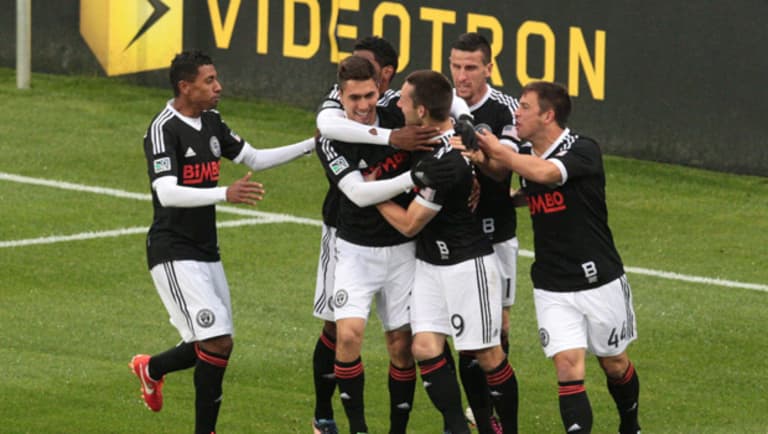
The Union in their Bethlehem Steel tributes | USA Today Sports Images
There’s a disease in design critique right now that causes people to see boring things and say “clean.” This an example of simplistic and direct actually being clean without being mind-numbing.
Philly’s retro throwback to Pennsylvania soccer forbears Bethlehem Steel FC (the 1911-1930 edition, not the USL team that was recently rebranded as Philadelphia Union II) integrated their excellent crest into a stunning design scheme that even got the sponsor to make noticeable changes for the sake of the cause. It’s a classic.
New England Revolution primary kit, 2016
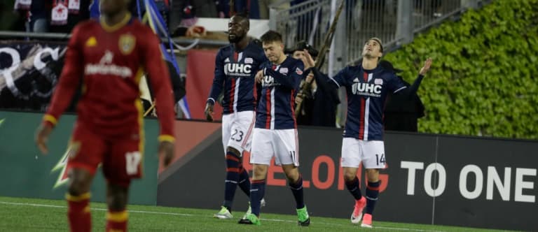
The Revolution in their 2016 look | USA Today Sports Images
The Revs took a small leap forward when they switched from a navy monochrome look to white shorts. They jumped to the top of the pack with their 2016 shirt. The middle striping feels instantly iconic. It’s a clear member in the pantheon of first kits this decade. In part for the all-around improvements and mostly because it just looks excellent.
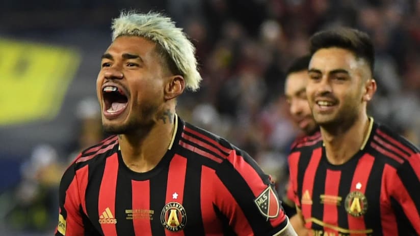
Atlanta United primary kit, 2017
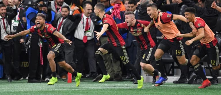
ATLUTD after their 2018 MLS Cup victory | USA Today Sports Images
The crest and the name had Atlanta’s first fans worried. If the kits were going to be half as bland, the entire identity of the team might be doomed. Seriously. Things seemed bleak for a team that the rest of the league’s followers had largely considered an unworthy addition.
Then they dropped one of the best primary kits in league history. When the kit design becomes the team’s nickname, you know you’ve made something relatively iconic.
Houston secondary kit, 2018-19
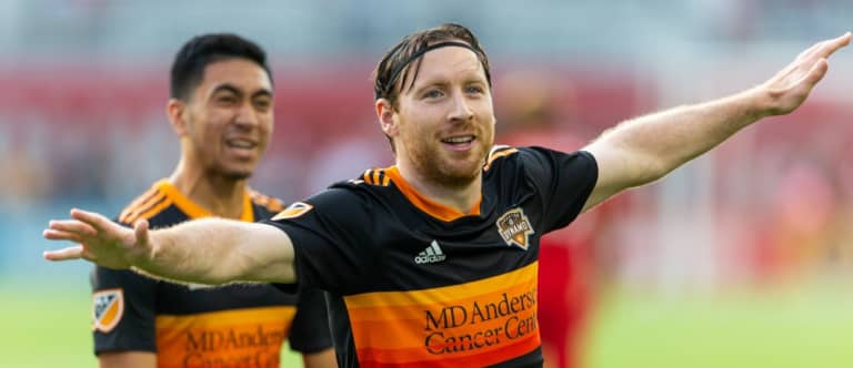
Tommy McNamara sports the Dynamo's "tequila sunrise" tribute | USA Today Sports Images
Pure, uncut Houston. Some people prefer the V-striped front of the prior secondary kit and they’re not necessarily wrong, but the stripes on this kit immediately have you thinking of the incredible 1970s Astros jerseys that might be the most recognizable piece of culture to come out of H-Town not named Beyonce. If you can call it a monochromatic kit, it’s one of the best of its kind this decade.
SKC secondary kit, 2014
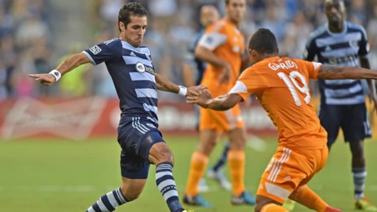
Benny Feilhaber in Sporting's hoops | USA Today Sports Images
Y’all were gonna be mad about the argyle kits when the hoop kits were sitting right there? SKC’s color scheme makes any combination of design and pattern difficult to mess up. When those elements stand out as truly excellent in comparison to their predecessors, you have a classic.
It’s not the best of the decade though. My personal best of the decade is…
Portland Timbers primary kit, 2019
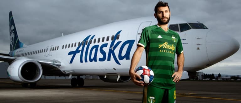
Diego Valeri models PTFC's current look | Portland Timbers
When there are so many teams on the planet and only so many people making kits, some uniforms feel a bit mailed-in. This is the opposite of that. The white and gold trim on the sleeves and color, the multi-striped socks and the dampened hoop design are stunning.
We can fight about which of Portland’s perpetually great kits are the best this decade, but I’m standing by the latest edition. Especially the version with white shorts. This is the kind of kit that makes you feel things. I am thoroughly evoked. Sure, Portland didn’t win MLS Cup this year, but they looked far better than the team who did. Whoever that was.

