Before Adrian Heath became their first coach, before the likes of Christian Ramirez and Francisco Calvo graced the pitch, there was one immediate draw to Minnesota United: their crest.
The consensus around the crest is that it’s a thing of beauty. The striking image contains many elements that are uniquely Minnesotan, especially at the center of it all: the state bird, the loon. But how did the team wind up identifying so closely with this diving bird?
The loon as a logo
When Minnesota United was bought by Dr. Bill McGuire in late 2012, he and then club president Nick Rogers decided that a rebrand was in order.
The club’s previous identity (the Minnesota Stars) didn’t have any clear ties to the local community, they thought. In fact, most local sports fan assumed the “Minnesota Stars” referred to the former North Stars NHL side that ended up relocating to Dallas.
McGuire, Rogers, and the rest of the staff wanted a design that tied soccer and the state together. Finding an identifiable image was essential to make the new branding take off.
“With the name, we wanted to tell a story that, first and foremost, this was unequivocally a soccer team," Rogers said. "Second, we thought it told the story of a club that would be a unifying force for a wide mix of soccer fans. Because the name is so non-specific, it becomes something of a blank canvas.”
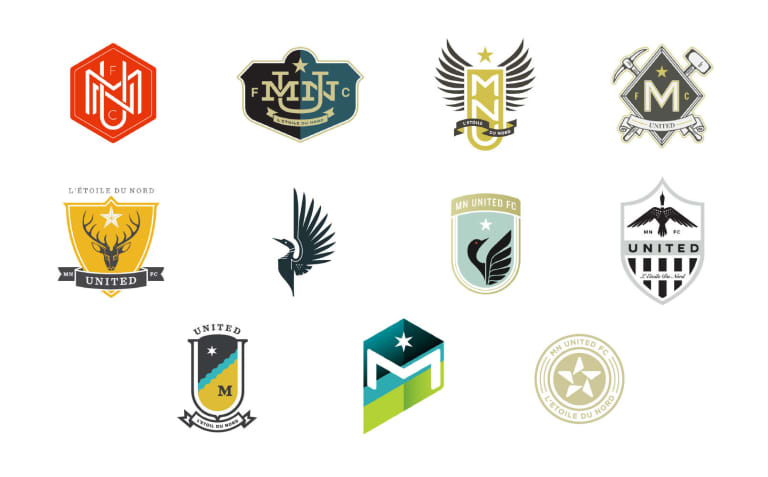
The team hired local design firm Zeus Jones to come up with concepts for a possible logo. The firm ended up proposing eleven different ideas, with areas of focus ranging from the club’s initials to mining tools for the iron range (and one including a deer). However, three focused on the state bird, and soon those designs became front-runners.

Logos via zeusjones.com
“We wanted the mark to be about the state,” Rogers recalled. “With all the ways you can represent a sports team in Minnesota, somehow the state bird – which is a very iconic-looking thing – was unused. More importantly, we liked how the designers had executed the idea.”
From logo to nickname
Four months after purchasing the team, the club revealed their new branding. The crest was an immediate hit, but some fans were slow to warm up to the United moniker. As Rogers recalls, supporters began calling the team “the Loons” very early on.
“It didn’t start internally,” he said. “The United name allowed fans to project onto the club what they wanted it to be. We coupled the name with a strong visual identity, and it sort of happened organically.”
Of course, it isn’t a new phenomenon to give a secondary nickname to a club named “United.” In England, legendary Manchester United are referred to as "the Red Devils," while Newcastle United go by “the Toons.” Evidently, Minnesota saw popularity skyrocket with the new identity, and within two years, the team was announced as an MLS expansion side. In many ways, the Loon branding may have something to do with the increased fan identification.
“It’s not a collective noun – there’s no plural to United that makes sense, like other team names in town," Rogers said. "People want to talk about the team in that way, so United almost forces you to organically adopt a name like the Loons. We embrace it – we certainly think it’s a great thing.”
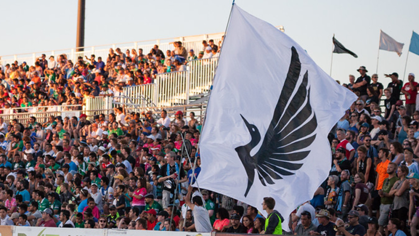
Matchday atmospheres for Minnesota United are replete with nods to the loon. Ahead of kickoff, a common loon call is played over the speakers. The team’s mascot, PK Loon, walks through the concourse and sometimes partakes in penalty kick shootouts with fans. A video segment – "Learn Your Loons" – is a staple of the pregame program, including one installment showing players trying their best loon call.
For a state with such an eclectic soccer history, everything has finally settled into place. Their top-flight side has a truly iconic brand rooted in the state’s culture. And, as the Dark Clouds attest to in a Kylie Minogue-influenced chant: “I just can’t get you out of my head / Loons, your goals are all I think about."


