The new Vancouver Whitecaps primary jersey has more of a "whitecaps" feel to it. Literally and figuratively.
The club released its new first kit at a private event held on Wednesday night at the Rocky Mountaineer Train Station, becoming the latest club to unveil its new look as part of the first-ever MLS Jersey Week.
Fans can purchase the new shirt by clicking here.

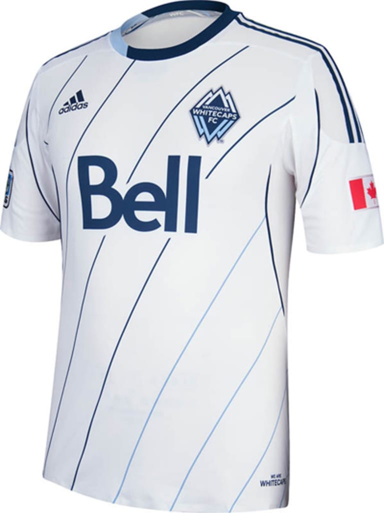
Why is it more of a "whitecap" jersey? The lines that have crossed horizontally along the front of the jersey in recent seasons, have been tilted to match the angle of the whitecaps depicted in the club's logo.
"It's an evolution of the white home kit that they've had before," said adidas product manager Mike Walker. "But instead of going from the horizontal bars, we've now added motion to it. So it's kind of like the whitecaps that we were inspired by. So the lines themselves actually flow with the jersey and add some energy and then they shift colors going from their dark blue to their light blue."
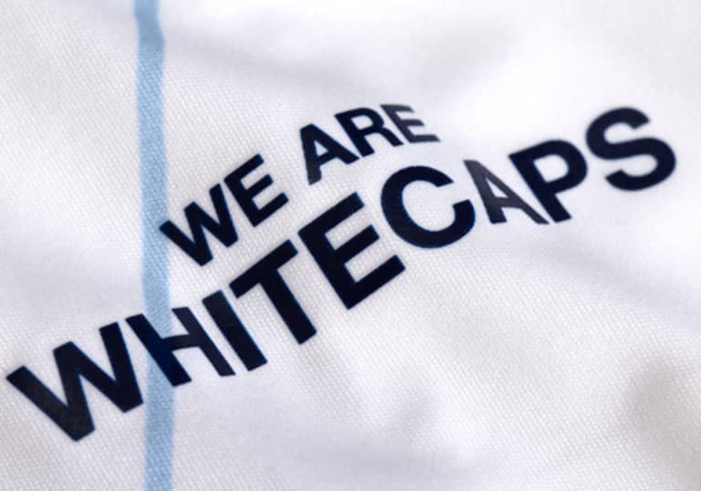
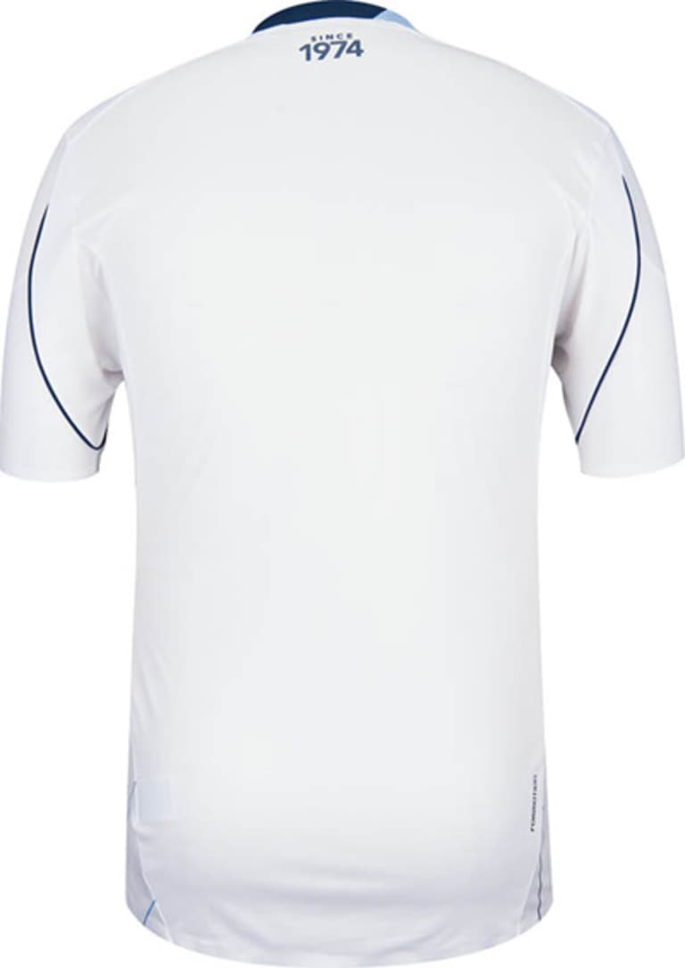
The kit, which also features a new "We Are Whitecaps" saying at the jock tag, also gives a nod to the club's history well beyond the "Since 1974" printed on the back.
"Paying homage to the old Empire Field stadium, we have the ribbon that was used there up in the neck tape," Walker said.
2013 VANCOUVER WHITECAPS PRIMARY JERSEY (FRONT)

2013 VANCOUVER WHITECAPS PRIMARY JERSEY (BACK)


