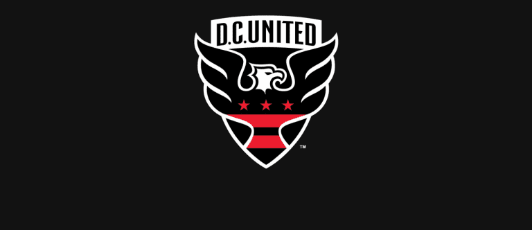
D.C. United on Thursday unveiled a new updated logo ahead of the 2016 MLS season, only the second time in the club’s 20-year history that the team has changed its crest and the first time since the 1997 season.
The new logo, unveiled at a season ticket holder event on Thursday night, features a new shield shape, an updated word mark, an enlarged eagle and the stars and stripes of the Washington, DC, flag.

According to the club, the new look is meant to maintain a strong tie to club tradition, using an evolution of the existing brand rather than a complete overhaul to better represent the United community. The team indicated that the redesign was a product of thorough market research on the state of the club’s brand conducted over the last two years which pointed to the need for modernizing and reflecting the growth of the sport and the league in the United States.
The logo reveal also coincides with D.C. United plans to move into a permanent, soccer-specific stadium in Buzzard Point after calling RFK Stadium home since their 1996 inaugural season.
“It’s a transformative time for our brand,” United chief operating officer Tom Hunt said in a team statement.
D.C. United partnered with Red Peak Group in the redesign process. Designer Pete Horridge, who has worked on the redesigned badges for Liverpool and the England Football Association, as well as the Royal Coat of Arms for the Queen of England’s Royal Household, handcrafted the final design.
- For more on United's logo design, visit DCUnited.com
The club provided the following, more detailed explanation of the logo’s new design features:
WORDMARK: The wordmark at the top of the crest features a new, hand-lettered font, bringing contemporary design and greater readability, while also showcasing the confidence of the evolved brand.
SHIELD: The shape of the shield is based on the George Washington family crest, which dates back to 1559, and provides a distinct connection between the club and the nation’s capital.
STRIPES & COLORS: The “Stars and Bars” are taken from the District of Columbia's flag, which originate with the Washington family crest, meant to create a bond with the District. The red coloring is intensified to reinforce the club’s passion, while the overall logo presents itself as more black, representing United’s grit and conviction.
EAGLE: The shape of the eagle’s head has not changed since the team’s inception in 1996, maintaining a sense of tradition, but it is now turned to the right to depict it confidently looking forward. The wings of the eagle have been enlarged and escape the shield, reinforcing club's value of freedom.


